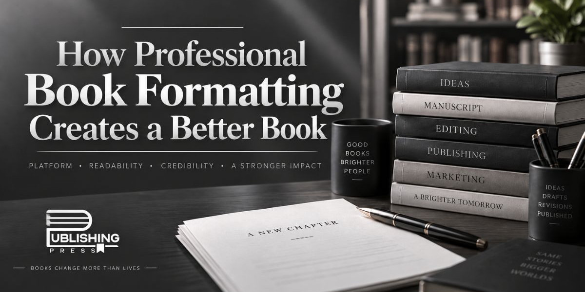

Book formatting determines how the text, headings, chapters, page numbers, margins, spacing, illustrations, and other elements appear throughout the finished book. While readers may not consciously notice excellent formatting, they quickly recognize poor formatting when pages feel crowded, chapter titles are inconsistent, paragraphs are difficult to follow, or an eBook displays incorrectly on different devices.
Book formatting improves readability, creates visual consistency, supports publishing requirements, and helps a book appear credible alongside traditionally published titles. For independent authors and publishers, investing in book formatting services can make the difference between a manuscript that feels unfinished and a book that looks ready for the market.
What Is Professional Book Formatting?
Professional book formatting is the process of organizing and styling a manuscript so that it meets the visual, technical, and structural requirements of publishing. It includes much more than choosing a font or adjusting paragraph spacing. A professional formatter considers the complete reading experience from the opening pages to the final section of the book.
For print books, formatting includes page size, margins, line spacing, paragraph indentation, chapter openings, headers, footers, page numbering, typography, section breaks, and the placement of images or decorative elements. The formatter must also consider how these elements will appear after printing and binding.
For eBooks, formatting focuses on responsive layouts that can adapt to different devices and screen sizes. Readers may open an eBook on a Kindle, tablet, smartphone, or computer. The content therefore needs to display correctly even when users change the font size or reading preferences.
Professional book formatting combines design knowledge with publishing technology. The objective is to create a polished book that looks attractive while remaining comfortable and intuitive to read.
Why Book Formatting Matters for the Reader Experience
Readers expect a book to feel effortless to navigate. When formatting is handled correctly, readers can focus entirely on the content instead of being distracted by the layout. Every design decision should support the reading experience.
Proper line spacing makes paragraphs easier to follow, while appropriate margins prevent text from appearing crowded near the edge or binding. Consistent chapter headings help readers understand the structure of the book, and carefully selected fonts improve readability without competing with the author's message.
Poor formatting creates the opposite effect. Pages may contain awkward gaps, inconsistent indents, incorrect page breaks, or text that appears too close together. These problems can make even an excellent manuscript look less professional.
A professionally formatted book guides the reader naturally from one page to the next. The layout becomes almost invisible because everything appears where the reader expects it to be. That consistency creates a smoother and more enjoyable experience throughout the book.
Professional Formatting Creates a Strong First Impression
Readers often begin forming an opinion about a book before they have finished the first chapter. The cover attracts attention, but the interior design influences whether the publication feels professional.
When readers open a well-formatted book, they immediately encounter organized title pages, copyright information, chapter headings, consistent typography, and balanced page layouts. These visual details communicate quality and preparation.
An improperly formatted book can create doubts about the publication even when the writing itself is strong. Uneven spacing, inconsistent fonts, misplaced page numbers, or poorly structured chapter openings can make the book appear rushed or unfinished.
Professional presentation is particularly important for self-published authors who are competing with books produced by major publishing companies. Services provided by a full-service book publishing agency such as Publishing Press USA can help authors prepare manuscripts that meet professional publishing standards while maintaining a consistent visual identity.
Print Book Formatting Requires Technical Precision
Formatting a paperback or hardcover book involves specific technical considerations that are easy to overlook. Print books have fixed dimensions, meaning every page must be designed according to the selected trim size.
Margins must be carefully calculated, especially near the binding. The inner margin, often called the gutter, usually requires additional space so the reader does not have to force the book open to read text near the spine. Outer margins must also provide enough white space to prevent pages from feeling overcrowded.
Page numbering requires careful organization as well. Front matter such as the title page, copyright page, dedication, acknowledgments, preface, or table of contents may follow different numbering conventions from the main text.
Formatters also manage widows and orphans, which occur when a single line of a paragraph appears alone at the top or bottom of a page. These small details can affect the visual quality of an entire spread.
Professional print formatting ensures that the final PDF file is structured correctly for platforms such as Amazon KDP, IngramSpark, and other printing or distribution services.
eBook Formatting Creates a Flexible Reading Experience
eBook formatting requires a different approach because digital books do not have permanently fixed pages. The layout must respond to the reader's device and preferences.
Most eBooks use reflowable text, allowing readers to enlarge fonts, adjust spacing, or change screen orientation. A professionally formatted eBook must remain organized regardless of these changes.
Chapter breaks, headings, images, hyperlinks, and navigation elements must be coded and arranged correctly. A functional table of contents is especially important because it allows readers to move directly between sections without searching manually through the book.
Images must also be optimized so they display clearly without creating unnecessarily large file sizes. Incorrect image placement or formatting can cause text to overlap or create large blank spaces.
Professional eBook formatting helps ensure consistent performance across commonly used reading applications and devices while giving readers the flexibility they expect from digital books.
Typography Plays an Important Role in Book Design
Typography is one of the most important elements of book formatting. The font used throughout the manuscript should support the content rather than distract from it.
Professional formatters consider font style, size, weight, line height, spacing, and hierarchy. Serif fonts are commonly used for longer printed texts because they can create a comfortable reading rhythm, while other font styles may be selected depending on the genre and design direction.
Heading typography also establishes structure. Chapter titles should be visually distinct from subheadings and body text. Consistent font choices create visual harmony throughout the publication.
Genre also influences typography decisions. A children's book may use playful and expressive typography, while a historical biography may require a more traditional appearance. Business books often benefit from clean, structured layouts, while fiction typically prioritizes uninterrupted reading.
Professional book formatting combines typography with layout to create a design that complements the author's content.
Formatting Helps Establish Consistency Throughout the Book
Consistency is one of the clearest signs of professional publishing. Every chapter should follow the same formatting rules unless there is a deliberate design reason for variation.
Paragraph spacing, indentation, chapter headings, subheadings, quotations, lists, image captions, headers, and page numbers should follow a defined style throughout the book. Without a structured formatting system, small differences can gradually appear across a manuscript.
For example, one chapter may have additional spacing below the title while another begins immediately with the body text. Some headings may appear bold while others use different fonts or sizes. These inconsistencies may seem small individually, but together they make the book feel unpolished.
Professional formatting creates a unified system so the publication feels like one complete product rather than a collection of separately designed pages.
Different Book Genres Require Different Formatting Approaches
There is no single layout that works for every book. Formatting decisions should reflect the book's genre, audience, and purpose.
Fiction books usually require clean typography and simple layouts that allow the story to remain the primary focus. Chapter openings may include decorative elements, but the overall design is generally subtle.
Nonfiction books often contain more complex structures. Headings, subheadings, quotes, lists, tables, footnotes, references, diagrams, and other elements may need to be organized using multiple formatting styles.
Children's books may require precise coordination between text and illustrations. Poetry collections need careful attention to line breaks and spacing because formatting can directly affect the meaning and rhythm of the writing.
Cookbooks, educational books, manuals, memoirs, workbooks, and academic titles each present their own formatting challenges. Working with experienced publishing professionals helps ensure that the layout supports the specific type of content being presented.
Professional Book Formatting Supports Publishing Platform Requirements
Publishing platforms establish technical requirements for files submitted for printing or digital distribution. Authors who overlook these standards may experience file rejection, printing issues, incorrect margins, missing fonts, or unexpected layout changes.
Professional formatting takes these requirements into consideration before the book is uploaded. The formatter can prepare print-ready files according to trim size, bleed settings, margins, image resolution, and other platform specifications.
For digital publishing, file structure and navigation must meet eBook standards. A properly prepared file reduces the chances of errors appearing after publication.
A full-service publishing agency such as Publishing Press USA can help authors manage formatting alongside other stages of the publishing process, including manuscript preparation, cover design, publishing setup, and distribution support.
Book Formatting Can Strengthen an Author's Professional Image
Authors are not only publishing individual books; many are also building long-term professional identities. The presentation of each book contributes to how readers perceive the author and their work.
A polished interior design demonstrates attention to detail. Readers, reviewers, booksellers, and industry professionals are more likely to treat a book seriously when it meets familiar publishing standards.
Consistent formatting can become particularly valuable for authors producing a series. Using similar chapter styles, typography, page layouts, and visual elements across multiple books can help establish a recognizable publishing identity.
Professional book formatting therefore supports more than readability. It contributes to the author's reputation and helps position the book as a professionally produced product.
Common Formatting Mistakes Authors Should Avoid
Many formatting problems occur when authors try to design an entire book using standard word-processing software without understanding print or eBook requirements. Extra spaces, manual line breaks, tabs, inconsistent styles, and repeated empty paragraphs may look acceptable in the original document but cause problems during conversion.
Another common mistake is selecting decorative fonts that become difficult to read over long sections. Fonts should enhance the reading experience rather than simply look attractive on a computer screen.
Incorrect margins can also create serious printing issues, particularly near the binding. Poorly placed images, inconsistent chapter openings, missing page breaks, and incorrect headers can further reduce the professionalism of the book.
Professional formatters identify and correct these issues before publication, allowing authors to avoid costly revisions after a book has already been uploaded or printed.
Why Professional Formatting Is Worth the Investment
Authors often spend months or years developing a manuscript. After investing that amount of time into writing, editing, and revising the content, presenting it with weak formatting can reduce the impact of the finished publication.
Professional book formatting adds the final layer of refinement that transforms edited text into a market-ready book. It improves readability, strengthens visual consistency, supports publishing specifications, and helps the final product meet reader expectations.
The cost of formatting should therefore be viewed as part of the overall publishing process rather than an optional decorative expense. The objective is not simply to make pages attractive. It is to create a functional reading environment that allows the author's writing to perform at its best.
Final Thoughts
Professional book formatting is one of the most important steps between completing a manuscript and publishing a finished book. Good formatting creates structure, improves readability, supports technical publishing requirements, and helps readers navigate the content naturally.
Whether an author is publishing a novel, memoir, children's book, business title, educational guide, poetry collection, or nonfiction work, the interior design should reflect the quality of the writing itself. Professional formatting ensures that typography, margins, chapter layouts, page numbers, navigation, and visual elements work together consistently.
Authors who want support beyond formatting can also work with a full-service book publishing services agency such as Publishing Press USA, where multiple stages of the publishing journey can be managed within a professional production process.
Ultimately, readers may never stop to compliment perfect margins or consistent paragraph spacing. That is exactly the point. Great book formatting allows the design to disappear into the background so readers can focus entirely on the words, ideas, characters, and stories that made the book worth publishing in the first place.